| Wallpaper Making for the Sims By Heather |
|
Making a good wallpaper is an easier task than one might think. There are a lot of great resources on the web for wallpaper, whether you use a site that has textures or a wallpaper site. Texture sites are the best resources for finding seemless designs, but wallpaper sites are best for finding something you might actually like in your sim home. Once you find a good resource (try google.com) then you are ready to start making some walls. The most important thing when looking for a good wallpaper is finding one with a repeating pattern. It's easy to find some striped patterns that repeat, because they are easier to work around. However, I want to focus on more complicated patterns for you.
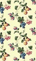
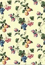
This lovely fruit wall has a repeating pattern, unfortuanately, the repeat is offset. This means that although the repeat can be seen, it doesn't quite work from side to side because they cut it too short of the pattern. (Click images to view full size.) To get around this problem, the first thing that needs to be done is cutting out one section of the wall to get the repeating pattern. Zoomed in, I use the rulers (CTRL-R) in photoshop to select the area I want to crop. Then using the square selection tool, I line up the edges with my ruled lines and crop them. (Image - Crop).
I now have one little pattern that repeats when offset. I still can't line it up from side to side, but I do have the whole pattern. So what I need to do now is make the wallpaper wider and offset it.
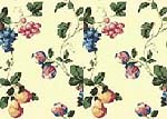
First select the whole image (CTRL-A) and copy it to your clipboard (CTRL-C), then paste it into a new layer (CTRL-V) and double the width (Image - Canvas Size). Be sure to expand the image from the left so that you have enough room to place the entire image on the right side of the canvas.
Now the second half (right) should be in a new layer. Position the second half so that it is flush against the edge of the first half. Obviously, we still need to line up the image correctly.
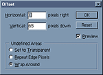
Do do this, you will need to use the offset tool (Filter - Other - Offset: 0 horizontal, 66 vertical in this case) on the right half to 1/2 of the total image height. (This setting may vary according to the wallpaper you are adjusting.)
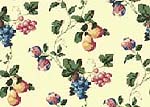
If you did your offset positioning correctly, your image will have a pretty repeating pattern horizontally. Notice that if you were to wrap the image horizontally using the offset, both sides should match up. You may want to test it at this time. This is a good test for your other wallpapers to see if any blending is needed.
You now have a taller version of what you have before and the bottom already matches up nicely with the top because no offset was required for that portion.
|
Now you have some pretty wallpaper that tiles correctly and is at the proper size for HomeCrafter which you will need to download if you don't have it already. You can either import your wallpaper as a bmp or jpg. If you experience problems with the color changing, you may try the other format to see if it fixes. TIP: Homecrafter only makes wall with around 89 colors (I haven't been able to get an exact number as my source was not sure), so if you experience a lot of problems, you may want to index your walls to 89 colors adaptive to get the best image possible. I think importing wallpaper into HomeCrafter really needs no explanation. Import it, click the big button at the bottom to add name, price and desciption. If you can't see the wall in your view window, right click and drag your cursor around to reposition it. When you are finished, click the export button which is right above the exit buttom (which I often click by mistake). Voila...wall.
Adding a border is no different than adding wallpaper. Find a repeating pattern, trim the edges and size down. Here I took it one step further. I added black lines underneath the moulding, then used the gaussian blue (Filter - Blur -Gaussian Blur) to create a shadowed effect. For the border, I did almost the same thing, except I duplicated the layer and moved the bottom one down two pixels. Then with the layer protection on, I colored it black Then turned the layer transparency protection off, use the Gaussian Blur to make the border stand out more. I also reduced the opacity of that layer so that it wouldn't be as dark. This allows some of the yellow to show through and makes it look more natural. Using white on a new layer over the top of each moulding area, I used the same gaussian blur effect to create highlights. That's it for today folks. Happy Sim Shopping.
|


 Now
set your image width to 128 pixels wide. (Image - Image size). This
is the recommended width for walls. You want the height to equal
240 pixels, so this one isn't quite tall enough so we need to adjust
that. Copy the entire image again, paste it into a new layer and
resize the canvas to 128x240 pixels.
  Now
drag down the copied portion aligning the top of this layer with
the bottom of the layer(s) beneath it.
 You
can now play dress-'em up dolly with your new wallpaper. Each HomeCrafter
comes with this wall template. While it gives you a general size
to go by, I wasn't happy with the measurements they gave us. Test
and adjust yours to the height you desire. My chair rail is usually
about 86 pixels from the bottom. For the purpose of this tutorial,
I will use the Chair Rail Template from Maxis.
 I pasted the template into the same image with my fruit wallpaper
and then created an empty layer above it. Using the square selection
tool, I selected the chair rail areas and filled them in with green
because I'm sick of white. I locked the transparency on the layer
so that I can paint over the chair rail without getting out of the
lines.
 If
you save your layers, you can reuse your chair rails and moulding
with ease.