
 |
 |
 |
 |
 |
 |
 |
 |
 |
I'm Just a Sim
| Original. Click pictures for Close-up |
 |
| Sample 1 |
 |
| Sample 2 |
 |
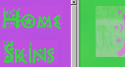
Vima - I'm just a sim, little old me, don't let me out of your site. I'm just a sim, all pretty and petite...bbbblinded by the light....purple and green are both great colors, but not on this site! My eyes are offended by this loud display of colors. Assuming that you're trying to keep it bright and fun, I'd make a few suggestions for a color change.
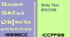
I consulted Heather at SimFreaks for some advice, since she designed this site and I saw her pop-online today...I think she was hiding from me last week after that Canadian Sims thing. Anyway, she showed me these samples of alternate greens a purples.
The background and the text are too bright for my delicate eyes. Now this may be a little tamer than you'd like, but the colors on Sample 1 are pleasant and the text is a little easier on the eyes. We used a fun font, but not one that was over decorated. The decorated font is nice for the title, but a little too busy for the buttons. We used the font Styrofoam Feelings from Larabie Fonts. To me this one looks more like an easter egg.
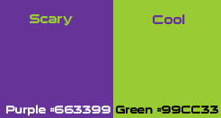
If you want it to be a little more exotic and fun, you could try this strange combination that I really like! Sample 2 is still fun shades, but with more contrast. We used the font Sui Generis from Larabie Fonts.
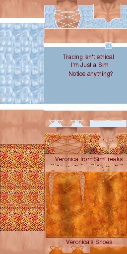 Uh,
oh. Houston, we have a problem. Heather just showed me something that's
fit for a juicer. While they did try to no directly copy someone else's
work, it looks like we have a tracer.
Uh,
oh. Houston, we have a problem. Heather just showed me something that's
fit for a juicer. While they did try to no directly copy someone else's
work, it looks like we have a tracer.
At any rate they are knock-offs of the originals. Sort of has me wondering who else they've ripped off with tracing. Shame, shame young ladies.
Now, if you are going to copy someone's work, try to make it look just as good, or better. While Veronica's lines are smooth...the I'm Just a Sim skin is well, jagged and roughed. Just look at the back strings. The lines just aren't smooth and the edges around the back hole are rough as well. The basic curves of the original skin are lost in the cheap wal-mart style knock-off.
Also, the solid blocks of color with no texture or shading, just make a skin look blah. Texture has been used to a small extent, but without that added shading, it's just not worth it to me.
I would've checked out some of the others, but links aren't working...hmmm. One of those looks very familiar. Now looking into this more, these skins won't even work in your game. They haven't been named properly to match the meshes. Credit hasn't been given to the mesh creator and in some cases the mesh isn't even provided.
If you download these skins and install them, you're going to have a big mess in your game. Now that's if you can even download them, because a good number of these links didn't work. Probably something as simple as a capitilization error.
The objects were scarying me. I had to go away...I just don't care for the color first off, and the display made them look very unattractive.
Now these girls are young and have a lot of time to work on improving their site...and creating their own designs. In my better judgement, I think they should removed their traced work and perhaps keep the tracers to themselves, until they can make some on their own.
Houses...broken link. Guests...nothing.
My favorite page was the staff page. Beautiful young girls reminding me of what it was like to be young...ah, memories. "Dane, turn your head...they are too young for you!" ;)
One martini for the clean layout...but I don't think it's a download day.
![]()
![]()
Skyler - Well, the main page is very bright, I think it needs to be toned down just a bit. Purple and green can be pleasant when the proper tones are used. I find the font rather hard to read, but it does have a "fun" feel to it.
On to skins first... Hmmm, some of them could use more texturing, and shadowing, but they aren't bad. I did try to download a couple of them and the links were broken. Might want to take a look at all the links on your pages to see if they're working properly ;)
The "sets" they're referring to are walls and floors, and they are sets :) Not my taste either but they aren't bad, and the ones I looked at tile up perfectly. I'm sure someone must be enjoying them in their games. Again I prefer a more realistic look.
Objects... Well, on the main page the webmaster admits they aren't great, and promises to have better ones coming. The pink and mint checkers that have been applied to objects aren't done horribly bad, the mirror is cute, but that counter needs some serious help. Maybe until you it get figured out, you might want to leave it the original white with the checks running down the center of it? Just a thought :)
No houses, however there is a link to them :/ No guests objects, again a link to them :/ :/
Well, it seems this cute little site is run by two young gals that happen
to be sisters, they have cute pictures up of them with their bios. I give
these girls two glasses, and hope to see them concentrate on skins. I
think the younger Sims players will love to check out the skins that are
available!
Well, it does appear CC has finally gotten a little starry eyed, even if it is over a silly cursor, it's a start (no more denying she has it in her!!! LOL). To bad I missed her when she was so preoccupied with that cursor... It would have been a hoot to walk up behind her and "goose" her LOL :)
![]()
![]()
![]()
![]()
Squeegee - Right off the onset I can tell that this site has a feminine touch to it. I just don't think that the color mixture really does justice to this cute site. With the lack of all the animated or details images, this site really is considered user friendly in my unassuming judgment.
The updates are a month old, but you can tell that the two young ladies were in the habit of updating once a week or so. I can only guess why they have not updated the news section. It could very well be that they are elbow deep into House Party??
I checked out the "Staff" page first and I was pleasantly surprised at what I discovered. In my past reviews, I always try to notice the personal touches a person might add to the site. Maybe it could be some self made graphics, or even a poem. But these two ladies share a personal side to them to let us know what they are interested in and also what they wish to do when they are old enough to start working. I really think that this is the first site I have been to where a person has shared what they want in life. I am fully aware that it's not "Sims" related, but this is sure a nice way to have more appreciation of the people behind the site when you spend 10 or 15 minutes looking at what they are offering to the Sims Community. Because when I then go into the "Skins" area and look at what is offered, I can then say to myself, "Look, that is what Courtney made and she loves her Cocker Spaniel named Samantha". That really brings the skins that you view to a more personal level.
In the skins section these two sisters come up with some pretty complex designs in the way of dresses. My favorite is the "Moon Goddess" which shows an impressive way that Lindsey was able to blend white into black in the short length of dress she had to work with. Her sister Courtney has made a very colorful summertime outfit in the children's section as well.
It's slim pickings in the "Sets" section. But you will be able to get a eyeful of the few things offered. Myself, they are just too intense and stunning for me. But these two girls do have the textures and designs down to a point that I will be looking forward to future downloads offered.
Overall, there is not much offered at this site. But is sure has a solid base for future offerings. I don't have any remarks as far as what I didn't like here. The colors were "loud" but that wasn't enough to cause fault. Because it's just my own personal preference. What made this site is that these two ladies wanted to share a part of themselves as well as what they have created.
It's an honor to submit a review of three martini glasses and a half chewed cherry.
![]()
![]()
![]()
Storel. - "Just a Sim" is a cute little site, staffed by 16-year-old Lindsay and her 12-year-old sister Courtney. The colors are bright but attractive, the layout is clean and simple (and works as well with Netscape as with IE, yay!), the text is quite readable, and the pages even load pretty quickly for a Geocities site. Partly, that's because there's not much on them yet -- 16-year-olds lead busy lives, and updates seem infrequent (the news on the home page hasn't been updated since February 14) -- but what's there shows promise.
The Skins section is the most populated, especially Women's skins. Several bright and sassy outfits here. The shading seems a bit blocky and the outfits have little texture, but those are skills that can be gained with practice. Although she credits several sites for their meshes at the top of the page, there is no mention on the individual outfits of which meshes were used.
I downloaded one outfit, the "tanspark" dress, that was obviously modeled on a mesh by Jerome of SimFreaks. Oddly enough, though, the dress was a B001 file, which is a shorts and tank-top mesh -- it looked rather peculiar as delivered, though it did look fine when I used SimShow to display it on the right mesh. According to the names of the zip files, all the skins were B001 files, so some "alteration" is necessary before you can use them, which seems a bit odd.
The Sets section includes half a dozen matching wall and floor sets. Some were bright, some more muted, and most were attractive. Not bad!
Objects: Lindsay says right on the home page that these were her first attempts at objects and admits they're not too good yet, so I wasn't expecting too much from this section. There is a bathroom set containing six items that match one of the wall/floor sets -- my least favorite set, unfortunately -- and that's it. The bath and shower were okay, but the counter had no texture or detail, and the rest of the items were somewhere in between.
The Houses and Guests sections have nothing in them yet. The Forum section had a small EZboard forum with 25 posts since early Feb. I noticed that on March 15 Lindsay said she was back from vacation and "Houses are almost done and many new GOOD objects." Wish she'd get around to putting them up on the site!
Overall, not bad but not great. Most items aren't bad for first attempts, but the lack of polish reflects the lack of attention. With a bit more practice and a few more updates, this could be a pretty decent little site. I give it two martinis, with an extra lime for the Netscape support.

| SCORING |
| Scoring is on a scale of 1 to 5 |